
 We continue the Horus Eye themed presentation of phallic letter combos found in brand imagery with a focus on variants where the same letter is used two times, repeating in some form to picture the genitalia. In addition to phallic forms, this presentation includes imagery of the female. As you may have already surmised, please note that this is subject matter for the mature.
 If you're new to the blog, welcome! To get up to speed with what this series is about, I recommend going all the way back to December 2010's Part 1 - See, it's the "i" of Horus!, or even all the way back to the end of October, 2009, where blocks of the foundation began to be set in place. On a related matter, if you find occasional references to matters of timing that don't make sense, you may find Beyond the Veil on TheOpenScroll.com very helpful as a course of study.
I'm going to address the sexual imagery then make another pass through to spotlight the Eye of Horus.
Two brands in this class (middle of the collage) were introduced earlier in the series, Gucci and Chanel (Part 35), representing a doubled G and doubled C, respectively. The first new branding in the collection I want to introduce is the doubled S representing Spire Fertility.
 What many or perhaps most probably see in the Spire Fertility graphic is nothing more than a heart, formed by the opposing connected letters S. When you recognize the heart as a vagina with spread labia (See "The Valentine - Illustrated" collage in Part 23) you may understand how this compares to the branding of a competing and/or partnering entity, the London Sperm Bank. I present the Starbucks logo (1987-1992) in the collage underneath Spire Fertility for the sake of comparison, as well as the Healthways branding under that. Compare also the three; Spire Fertility, Gucci and Chanel. Do you see what you're looking at?
The next brand I want to introduce is Harvey Shopfitters Limited. The phallic letters presenting the male package are the two letters T stylized in the title. The phallus is pictured pointing downward. Is that really a phallus? Consider the blue elements at the top of their branding. Stick figures, copulating. The female has her arms extended over her head and the male has his hands on her breasts. The company represented isn't in the porn or sex toy business but rather provides "fit-out and refurbishment services." Again, are the stylized letters T picturing the male genitalia? What other explanation could reasonably be offered?
Below that, the doubled opposing letters h in the branding for Home Hardware pictures the male member "buried to the hilt," comparing to the redbox brand's DVD packaging graphics.
Below that (at bottom left in the collage), the doubled opposing letters f representing forefront-studios pictures the same. Foreskin-studios?
To the right of that at bottom center, a similar doubled opposing letters F appears in a badge emblem featured on Fringe, a recent (2008-2009) Fox Network TV series. That show may become the subject matter of an upcoming series on this blog because it's so richly signaling! The Fringe Division DOD emblem has more than one level of interpretation. On one level it compares to the brand at bottom right, the last to be introduced here. I'll return to the Fringe Division imagery in a moment. I feel like I should apologize for this one in advance because, after seeing it, you'll probably wish you hadn't. Pacific Palms is a golf resort, hotel and conference center in the Los Angeles area. Their logo features the male package as two opposing letters P, disguised as a palm tree. Compare their graphic to the adjacent Healthways (See Part 29) and Fringe Division imagery. I still find myself muttering, "That's just so wrong!" I have to think that, somewhere on their Web site they must surely be offering special discounts to member proctologists.
Ok, if you're sufficiently recovered from that experience, take a look at the Fringe Division emblem and consider it from another perspective. This one is like the Healthways graphic in that it presents both backside and front side perspectives.
Consider the F as signaling the female gender. What you're looking at is like what would be seen during an exam at the OB/GYN clinic, and also what can be considered as a diagram from a frontal perspective. See the star variously as the urethral opening, glans clitoris or cervical opening. See the red inner circle with its opening at the bottom as the vagina. Where you read "Fringe Division" - think - fringe = pubic hair. Where you read "Department of Defense" - think - chastity belt or, perhaps hymen. Compare this to the Spire Fertility, Starbucks, Chanel and even the Gucci brands.
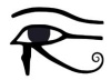
This sexed-up branding is also signaling the Eye of Horus, which is one with the serpent's reproductive "Mark of the Beast" scheme.
Most obviously, the concentric rings of the Fringe and Pacific Palms appear as eyes. The Pacific Palms version features a dot-in-circle sun symbol with its "anus bindu," signaling the sun god Horus. That feature also appears as a third eye bindi between the testicular "eye balls." Palm fronds form eyebrows from this perspective. Directly above the bindi is what must be the royal crown, a very common feature in occult symbols that signals the anti-messianic king, Horus. The orange star of the Fringe Division emblem should likewise be identified as Horus; Mr. Star-on-top, Mr. all-seeing eye capstone, perhaps crowning at the cervix as about to be birthed by Isis. The branding imagery of Harvey Shopfitters Limited has much more going on than just graphic sex! The blue delta above the red AR is the capstone of a pyramid. That blue on white procreating delta man is the heavenly divine capstone Horus! The pyramid body is composed of the transformed children of Adam, the red (Adam = red earth) and white (divine) pyramid suggested by the peculiarly angled letters A and V. The A and V are very frequently used together to signal, as paired opposing deltas, the sons of god (A) with the daughters of men (V). Between the signaling A and V appears the R, a letter so commonly used to signal Horus.
The letter R that saturates our environment in the Rx pairing bears the value of 18 as the eighteenth letter of the alphabet, leveraged for the 6+6+6 connection to Revelation 13. The H seems to stand apart. H is for Horus, of course! Another letter pair is called out in the word "Limited" that speaks to me of the arrogant declaration "I Am" - IM. "I will be like the most high" (Exodus 3:14 and Isaiah 14:14)! The "IM" call out also imports a 9 and 13. If you've been following the series long, there's no need to elaborate on what that signifies!In the forefront-studios branding, the pronounced gradient lighting effects with some wash-out highlighting may be recognized as a commonly seen illumination signal, the activation of the Eye of Horus, pineal gland and anja chakra. Forefront, like foreskin and also, forehead!
I don't see Horus in Spire Fertility's branding, beyond the mint color softly hinting at Osiris green. I do, however, see the S pairing as serpents, coming together as DNA windings and as one with the female to signal the union of the sons of god with the daughters of men.
 Home Hardware branding features the letter H centrally, and H is for Horus. The logo as white on red ringed by yellow presents a rounded square (the shape signaling Hermaphrodite and Baphomet that creates cognitive dissonance) sun with a couple of illuminating rays. Horus. If you explore their Web site you'll discover the set of images I present at right.
 Compare the aeroplan title to the London Sperm Bank's. The prince of the power of the air does indeed have a plan for you and I, a sort of "aeroplan" with reproductive activity in mind!
There's a Beaver sub-brand. Slang. Consider the positioning of the male counterpart of the parent logo. Subtle? No. Not really. It's directly under the AV pair too! Hey, is that beaver in estrus?
How about the image on the bottom. Our bodies are as earthly tabernacles, our dwellings, our homes. You already get the "Home hardware" reference to the male body's genital "hardware," right? Ok. Now, do you get the home ownership reference? Do you really want to be helped by those who want to own your home, your earthly tabernacle - you?
Are we offended yet? Horus wants to own you, my friend! The devil is bad. He's got the authority to do what he's doing. Praise the Lord who opens our eyes to expose the spells of the wicked who prey upon the ignorant and rebellious, who knows every weapon forged against us. He is our very shield and buckler! Y'shua HaMashiach, Jesus Christ, the son of the living God has a plan, and it is working!
In the context of a dark and evil medieval "church" (RCC) here in Sienna, Italy, where I'm traveling, I was (sadly) less-than-surprised to discover a mosaic of hexagons containing both eyes-of-Horus and crescent moons covering the floor of a side chapel. See: http://hg92.files.wordpress.com/2010/06/img_8482.jpg (not my photo). Could it get any more diabolical??
ReplyDeleteThat's pretty bizarre.
ReplyDelete